I began with the sketch (which I forgot to take a picture of), and I was looking through the inks and I got carried away. I decided to make it sunset, and used a lot of the warmer colors I wouldn't have gotten to use elsewhere. I learned how to layer but also mix the inks to create the fade. When I was doing the lettering, I realized that it was hard to read because of the deep color change, so I put white in the letters but still outlined them in black.
The best part was definitely the rock. I have no idea how to draw rocks and I looked up line art of mountains, and used that to create some of the shadows before going back in with a micron pen and adding some details. I decided not to put the creature on the mountain because I realized you wouldn't even see it because ink is translucent, so I just took it out and was proud of my rock.  I'm really proud of this piece because I was able to be really detailed but also because of the bright colors and the details that really pull it together. I don't enjoy coloring people because I feel like it looks worse, but this time I felt really good about it. I learned that in order to create layers with translucent ink, you have to mix it with white to make it be opaque, and then do a looooot of layers.
Overall, it was a fun experience and I loved working with the ink to create three dimensional figures and to work with all the colors and layers of the setting sun. I also learned how to break down larger problems bu taking them one step at a time.
0 Comments
When I was told we were doing a self portrait for our next project, I wasn't excited. I'm not a good painter, I didn't enjoy acrylic paints, and I honestly thought it would be a little boring to do something that was just me. While brainstorming ideas, we were told to 'be creative' and experiment with non-typical expressions or formats, and even still I wasn't excited because I've always been a fan of mildly unsettling art. Then I got the brilliant idea to take a pose that was well known, and put myself in it. I looked at many famous ancient paintings, but I decided to recreate 'the heart of Jesus' with my own set of strange beliefs. Instead of facing the camera head on like Jesus, I tilted my head and smirked, giving my character more personality. I covered my eyes and put a third eye to signify how people blindly follow religion and higher power, and the compass is showing how people look to religion for direction.
This idea was quite exciting for me, however, I have never painted with oils before. After experimenting, I decided I wanted it to be my medium because I liked the intense colors and texture. I really liked working in layers, especially when the bottom layer wasn't completely dry so I could incorporate more colors everywhere. The main success (that was also a challenge) was to show the texture. I love going my own way and using my own reasoning to figure out how to use a medium, and so while I did look at a bunch of resources, I often blatantly ignored them. That wasn't a problem, the problem was then trying to add contrast between certain sections of the art. I ended up achieving this by having a bunch of layers, with the brightest undertones first, and then putting duller colors on top and going back later with the darkest and lightest paints when those layers had mostly dried. Overall, I loved working with the oil paints, much more that the typical acrylic. It successfully added depth to my painting, and gave it a fuller feel that it definitely needed. It was also fun to mess around with tacky paint, and I greatly appreciated being able to wipe paint off of already dried layers. I learned many techniques on how to work with oil paint, and also developed my style as a painter. I learned how to add colors as undertones and bring many shades in both highlights and shadows. Despite the project being a self-portrait, I was able to bring a little bit of the unsettling aspect into my art.   Donna Cattiva (2019) Loribelle Spriovski is a Filipino-Yugoslavi artist located in Australia. Her art is inspired by the human body, specifically hands and faces. I love her art because while she takes the realism of a human face, she also twists it, adding abstract pieces to make the pieces seem deeper, or more unsettling. My favorite pieces of hers include the gallery of Homme, which are many abstract portraits of men, and the piece titled "Donna Cattiva." Loribelle is represented by many art museums, including Arcadia Contemporary and The House of Fine Art London.
For my entire book, I have the idea to make it follow the story of Orpheus and Eurydice, and for this spread I decided to have the pages be very similar but just show the passage of time. I ended up sketching this design I really liked that would end up being my final design.  So I started with the main colors, the black of the sky beyond the mountains, the yellow of the dunes and orange of the mountain ridge. I had all of this planned out in the beginning with exactly what I wanted, so I managed to get all this done quite quickly. The black is black ink with black streamers mod podged down on top of it. The letters are with white ink. The page is yellow with watercolor and the orange is a mix of watercolor pencils, colored pencils, and orange pens. The red path is made with thin strips of streamer and the couple was drawn on with white and black ink. The main challenge I had with this project was after I had completed the black, red, yellow, orange, and all the words, I didn't know what to do in the empty space on the pages. in one of my original ideals, I had drawn a blue lake so I decided to go with that. I tried making it with streamers, with watercolor, with pens, and I hated nearly all of them. I ended up cutting up other pages of the book to add texture and painting them blue and gluing them together. I'm still not completely in love with the final product, but it's too late to change it. i don't completely hate it either, I'm not just completely certain it matches the vibe of the rest of the work.  Overall, I really liked this spread, and it was a lot of fun to experiment with ink and streamers on the old pages of this book. The order of layering and the proper way to work with ink is going to be helpful for the other pages of this book. This project really forced me to think outside the box, for tidying up empty space, and making sure each section was very clean. I can't wait to continue working on the book to see how it ends up.  I had many different ideas going into this project. The concept of having a reflective surface in whatever set up was a bit challenging to me, I had to rack my brains for a list of twenty reflective surfaces.  ^This is the reference photo I took ^This is the reference photo I took I ended up choosing the idea of myself with a bunch of sunglasses because I liked the idea of wearing a the pairs and covering my face with it, with the sunglasses themselves reflecting me on them. For my reference photo, I had a yellow florescent light above me and a blue LED light a little below my chin to add depth and color to the shadows.  Color Sketch Color Sketch So I don't typically draw from photos, though it definitely was helpful when I was trying to get the proportions and shadows right. It was also nice because of the colored lights I had chosen to incorporate into my photo added these nice hints of color that I decided to really turn up when It came to the color sketch. I felt like the photo didn't have as much depth or saturation that I wanted, so I kinda went crazy in my experimentation of colors. I chose brown paper because the biggest issue I had with the color sketch was making my hair dark enough. I don't press all too hard with my colored pencils, so I wanted to make it easier for me. Also, I didn't like the way my hand is styled in the reference photo, so I free drew that. The challenges in the beginning was the proportions of the face to each other, and in doing so I strayed from my picture, and turned my head a little bit more forward and messed around a lot with the arm. When I drew my color sketch, the easiest part for me had been the neck and chest area, so I started there for my final one. Then I moved to my right shoulder and first layer of hair. I knew I wanted my hair to be more than just brown to make it more interesting, though the sketch first layer had more depth in the beginning and over time lost depth, which really sucked. I kept trying to darken it too, because my hair is very dark, and it cost me the individual strands that stood out in the first layer. The face was fairly easy for me, though I did add more colors then there are in the photo to make it match the rest of the body, because there was blues, teals, and reds on the neck and shoulders, but not on the face, so I took some liberties. After that, I added the arm, the background, and the glasses. In the sketch, I used pen for the glasses, giving them a pop-art style quality, but I decided against it in the final part. The hand was surprisingly easy, but I do enjoy drawing hands in my free time. The background was finished fairly quickly, though I had been worrying about it looking too lumpy or not uniform, but in the end I'm happy with how it turned out. When it came down to doing the actual reflection in the sunglasses, I hesitated. In my sketch there wasn't any reflection, and although I liked the way it looked, I didn't think it had (or needed for that matter) anything reflected in the lenses. After talking about it, I ended up putting little splashed of color into the edges of the glasses, as if the color of my skin was being reflected in the white. I like this idea because the sunglasses themselves have no shading and look very 2D, while the rest of me has colors to represent shadows and highlights. 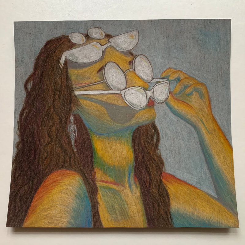 Overall, I am happy with how this turned out. There were some problems I faced with the medium of colored pencils, like how it is very streaky and you can see individual colored pencil lines, and I tell you no matter how many layers I put it changed absolutely nothing. I had to add black in the hair to add more dimension and it still does not look dark enough. In the end, I came to terms with it all because although it doesn't look super realistic, realism is not my goal as much as creating something colorful and perhaps a little unsettling. This picture looks more streaky than it does in real life, and you cannot see the colored highlights I put on the sunglasses, but have faith that they are there.
This project pushed me to become more accustomed to using colored pencils as well as using a picture to draw someone I knew. I hope to use the techniques, with saturation, using photos I took, and maybe even playing around with not being realistic, in my future projects, especially as I continue to delve into my own specific style.
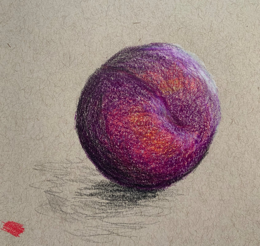
When I was choosing a fruit, I looked through the different ones at my house. There were bananas and peaches, but I chose the plum because to me, a plum's coloring is pink and reds hidden under a translucent skin of dark dark purple. The colors were just so pretty, and I wanted to capture the colors hidden under the purple.
When first sketching, I realized very quickly that the colors I had, were a little too vibrant, and so the more I would draw, the less it would look right. But that didn't really bother me, so I just continued with it. I began with doing the red and yellow undertones, and then went over everything with the dark purple. I don't really think I succeeded with the most accurate colors, but that also is part of my artistic style that I'm developing, where the colors are too bright, or not completely right. After the purple, I added the black because I realized that in my picture, the shadow was black and the light cast a white sheen on the plum. I really liked this project because it worked a little with texture and layering of colors. I think this will be really helpful for future projects, because most colorful objects have undertones. I think using darker colors to dull down brighter ones is something that I will continue to work on in my art. How I grew was through using brighter colors to bring to life a realistic piece of art, as well as making a textured, colored, picture. For this project, I wanted to explore bright colors that didn't really match to be used to show shading. I have always found that wrongly colored pieces of art are more interesting, and I didn't want to do the same things because I didn't really feel like that was expressive.
I started on the gray sheet of paper, because I figured it was the closest to white and would be the easiest for me to work with, seeing that this was my first time shading with color and 3D forms. The colors I chose all sort of faded into each other, and so I found it easier to made the transitions between colors. I also was introduced to shadows, which was a foreign topic for me. The next paper I did was the brown paper, and for this one, the cylinder and cone depicted the shadow side of the shape. This was incredibly difficult for me, I felt like the shadows never looked quite right, thought I couldn't really tell why. I think if I were to redo one page, it would be this one, and I'd try to make the contrasting colors blend a little more and make the shadows be less sharp. The last one I did was on the black paper, and I chose bright colors so even the shadows would pop on the paper. It was fun to work with bright shadows, and something I would definitely want to work on more because I really like the way it looked. A challenge with this page was the two 'darker' colors I chose were nearly opposites; orange and turquoise, though I am really happy with how they turned out. This project really helped me learn how to shade with colors, and how they don't have to fade to black, but rather other colors. All of my forms are recognizable, even though the colors are not the 'natural' way they would be in real life. Through this project, I also am becoming more accustomed to shading with colors, and where light hits certain places and bounces of certain places. I think the main part I will continue to do in my future pieces is play with realistic shapes and figures but change smaller aspects to make it less like real life and more abstract. It was a simple project, and yet I'm still quite proud of how they turned out. 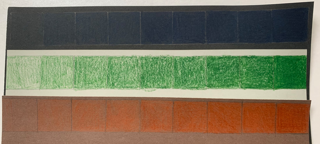 This was my first time doing value charts and shading, and it was definitely strange experience.
I chose colors that I thought would best match the papers, and I was really interested to see how they appeared on the page. I haven't really don'e much with colored pencils or colored paper, so it was definitely challenging for me to break down the project. I started each one with the darkest square, pressing hard on the paper to try to get the smoothest, darkest pigment. Then I'd go to the opposite end and do the opposite; try to do the lightest coloring. It was difficult to do the middle squares, because I didn't know when it would be too much. I think my best one would be the orange on brown paper, it was definitely smooth and easy to work with the lighter color. Overall, I think the project was a success, because I became more comfortable with using this medium. This entire thing was foreign to me, but in trying over and over I have definitely became more accustomed to this type of art. I think in the future I will try to work more with colors and shadings, and I'm excited to work on the 3D forms next. |
AuthorWrite something about yourself. No need to be fancy, just an overview. Archives
January 2021
Categories |


 RSS Feed
